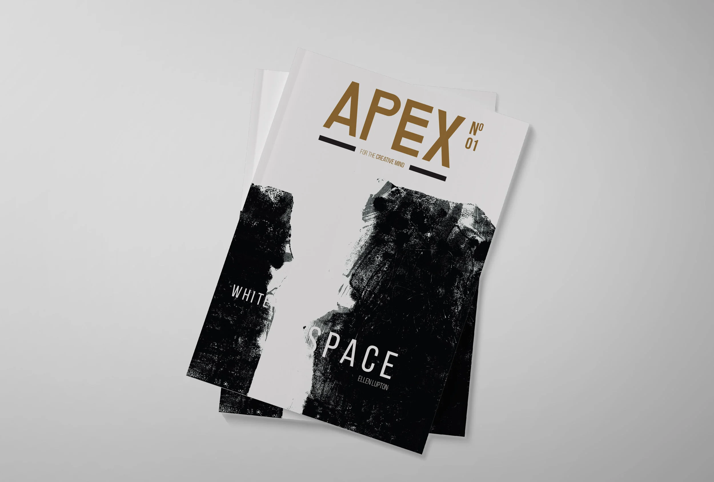
apex
magazine
Challenge
To create a logo, cover page and two spreads focusing
on two feature articles.
Idea
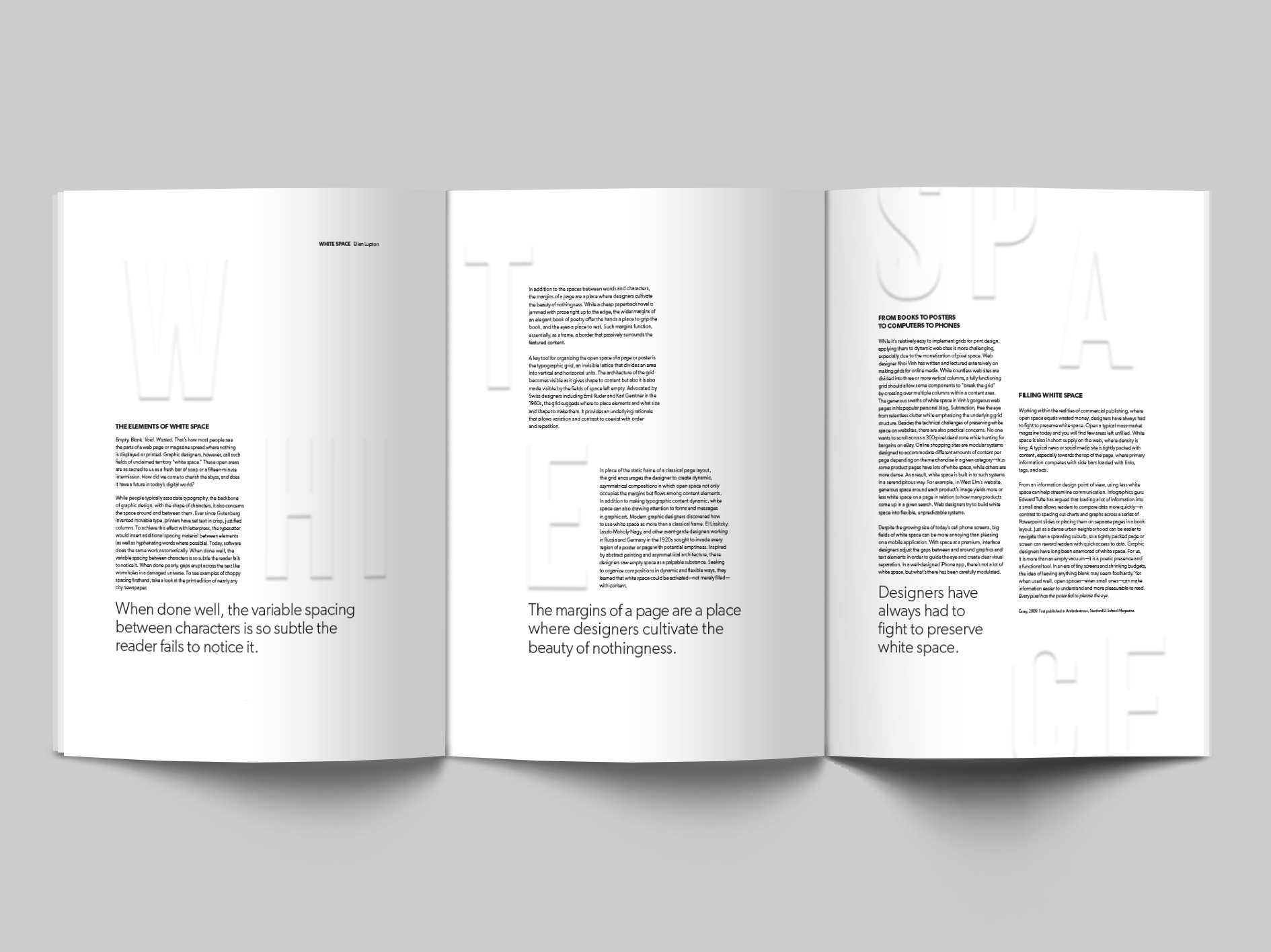
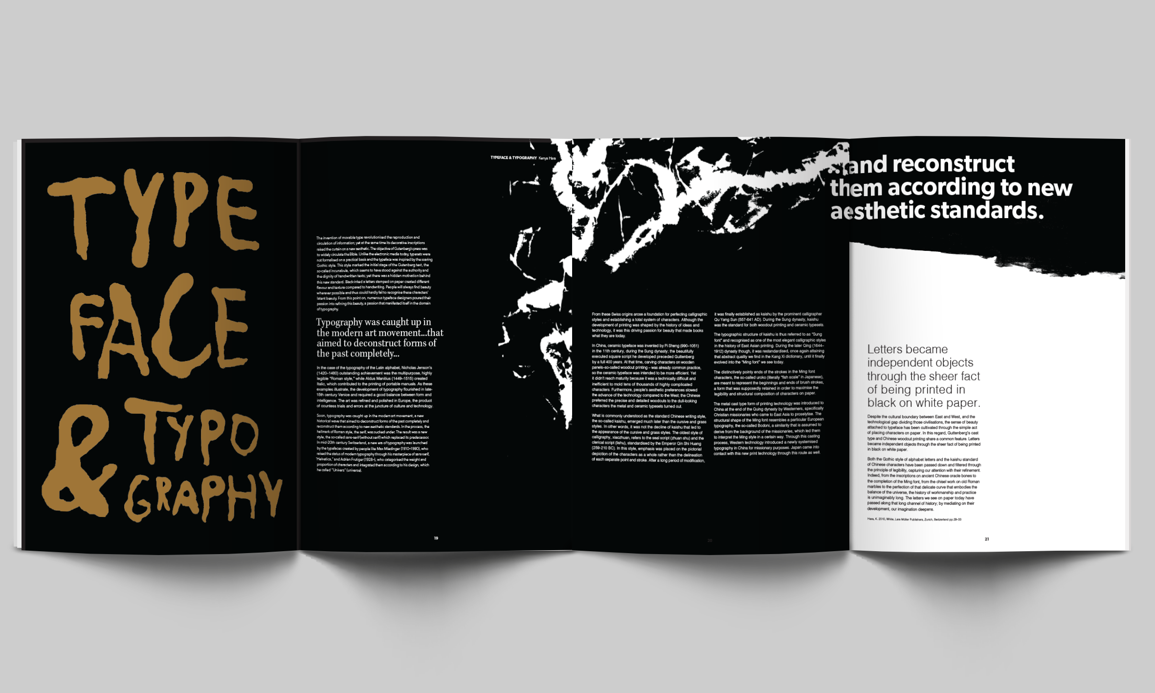
The idea was to explore the importance of white space in design and how its subtlety heightens its visual impact and effect, as well as an exploration of the evolving nature of typography and how it is never static.
Result
The use of an embossed heading for the first article highlights this subtle treatment of white space and a utilisation of hand generated typography and mark–making in the second conveys the volatility of type.